form design
2022-02-22 · 4 min read
Video: You Suck at Form Design
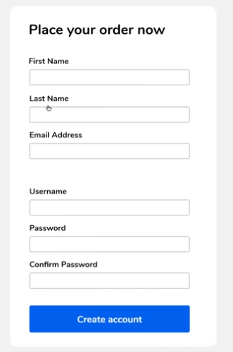
10 Commandments of Form Design #
- Align form elements.
- Place labels above inputs. Avoid labels to the left of inputs.
- Input labels must stand out.
- Focused input must stand out.
- Hard labels rather than placeholders.
- Errors should go next to exact input.
- Invalid input fields must stand out.
- Cramped forms look bad. Use effective whitespace.
- Avoid wordiness. Move extra info to hovers/dropdowns/etc...
- Keep num. fields manageable. Either multi-step or group if too many.
Examples #
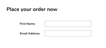
Alignment #
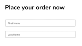
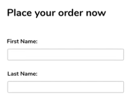
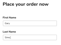
Before:
- The form inputs are not aligned with the heading.
- The form labels are to the left, which makes people's eyes zig-zag.
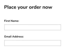
After:
Clear Input Fields #
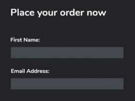
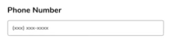
Before:
- The single colored underline is not enough to show that this is an input field. People might mistake them for page breaks.
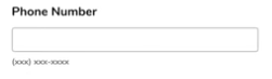
After:
A subtle background color helps to make form inputs stand out.
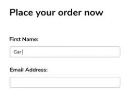
Clear Input Focus #
Before:
- The currently focused input field does not give any indication that the user is inputting into it.
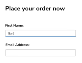
After:
Add a highlight, underline, background color, etc... to show that this field is focused.
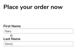
Use separate labels #
Before:
- This input relies on the placeholder to show what the input is for. However, the user might walk away and come back, or just forget what the field is for. Without a separate label that stays untouched, the user can get lost.
After:
Put placeholders outside inputs #
Before:
- When the user clicks on the input, the placeholder disappears. If the placeholder is conveying any useful information about e.g. formatting, then just put the placeholder outside the input so the user can always see it.
After:
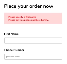
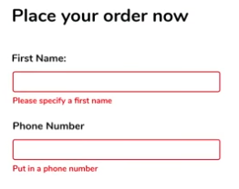
Errors go next to inputs #
Before:
- All the errors are just dumped at the top or bottom.
- It's not clear which fields need to be changed.
After:
- Ensure each error message is as close to the source as possible.
- Ensure the problem fields are properly highlighted red so the user can quickly identify which fields need to change.
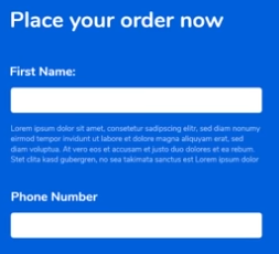
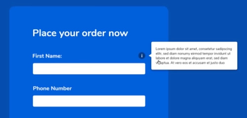
Minimize words. Move help to hovers/dropdowns. #
Before:
- Lots of words / explanation / supplemental info below the First Name field.
After:
- Move supplemental info into a hover text or pull-out thing so the actual form is clear.
Use effective whitespace #
Before:
- Inputs and labels are too cramped. Looks awful.
After:
- Just a little bit more whitespace makes things much nicer.
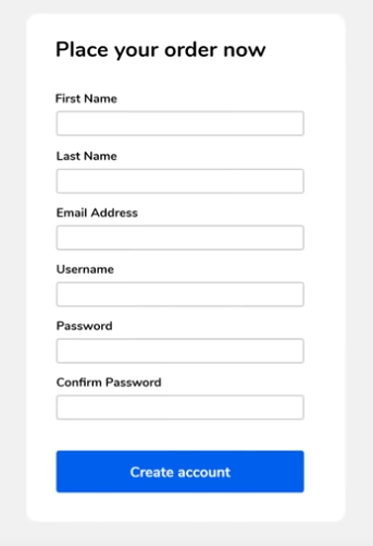
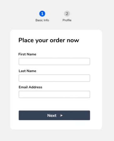
Avoid intimidating number of fields #
Before:
- Too many fields at once can be intimidating. Users will just give up and go elsewhere.
After (1):
- One option is to split the form into separate steps, so each step looks manageable.
After (2):
- Another option is to use some whitespace to group different inputs.